by Louie Jerome, Jul 11, 2008
Mistakes in interior design can cost a lot of money, not to mention the extra work involved in fixing them.
Don't be tempted to decorate a room just to follow the latest tends. Decorating is expensive and you need to think about how you are going to use the room and whether your design is practical. For example, purple may be an 'in' color but if you use it in a north facing family room you will make it feel dark and oppressive.
There are lots of other examples of impracticality of color and texture. These mistakes can be very expensive.
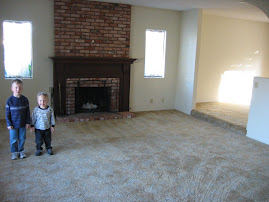
Choosing Impractical Floor Coverings
Would you, for example, use long pile carpet in a play room used by toddlers? It might make it soft and cosy but it would be very difficult to keep clean. Something easy to wash would be much more practical.
Buying The Wrong Light Fittings
Buying lighting fixtures can be expensive so make sure that the lighting you select is suitable for the room. Soft lights are fantastic in a bedroom, or adult lounge room, but if the room is used by a child, or for reading and studying, you might want to leave out the soft lights and concentrate on giving the room a bright, light atmosphere.
Hanging Artwork Too High
Display artwork at eye level where ever possible. If you fix paintings and wall hangings too high up on the wall it spoils the effect. Visitors have to crane their necks and look up at them.
Spreading A Collection Out
If you have a collection of things, or a group of matching items, display them all together in one group. It makes it easier to see what you have and it gives the display impact. Spreading the collection all around the house spoils the impact.
Separating Pairs of Items
Add pairs of things to a room to bring unity to the deign. For instance have two matching table lamps, two candlesticks, or even two matching pictures displayed together. Arranging things in pairs brings another dimension to a room.
Grouping Heavy Furniture
Don't put all the big, heavy furniture in a group on one side of the room. This makes the room look unbalanced and lopsided. Distribute larger items around the room and try to balance therm out.
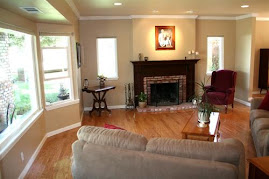
Choosing The Wrong Colors
Select colors carefully. A north facing room will look dark and depressing with too many dark colors in it. Even vibrant colors like reds and bright greens can feel heavy in a room with very little natural light. If there is little natural light choose whites and creams and maximise the light that's already there. Bright rooms with lots of light are not such a problem. You can really use your imagination there.
Not Taking The Occupants Into Account
When choosing the overall feel of a room take into account what it is going to be used for and who is going to use it. For example, cool blues and sharp lines may not suit a very 'girlie' girl, but frills, pretty pink curtains and soft textures will not suit your partner if he is a very 'macho' man.
In the long run it will save you time and money if you think about the room you plan to decorate before you start. Decide who will be using the space and what they would like, then consider what is practical and efficient in the area. Choose styles and décor that will not become outdated in a very short time and buy the very best that you can afford.
Subscribe to:
Post Comments (Atom)


No comments:
Post a Comment